


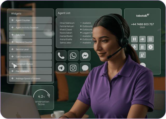
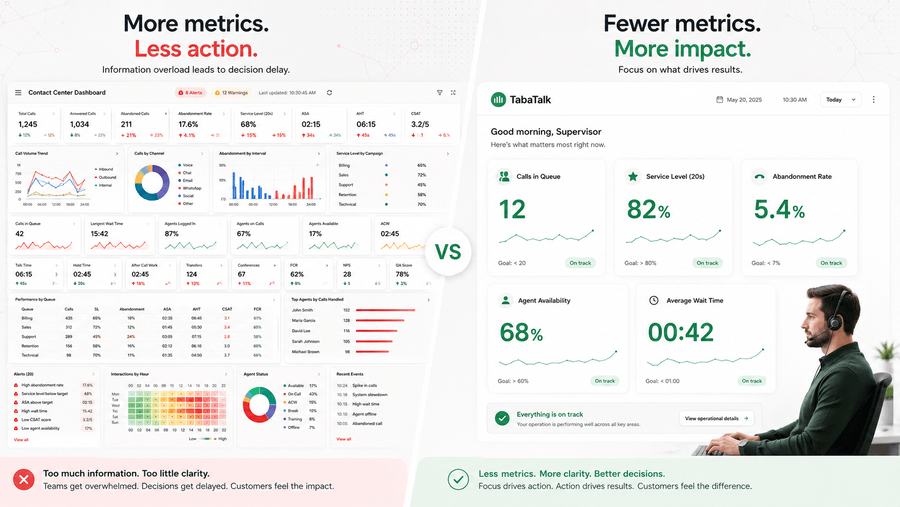
Most contact center dashboards are built by adding metrics, never removing them. A supervisor asks for queue time. An executive asks for cost per contact. A workforce planner asks for adherence. The dashboard accumulates everything, and within six months it shows 30 numbers that nobody checks because nothing stands out.
According to McKinsey’s 2022 State of Customer Care report, companies using customer analytics extensively are 23 times more likely to outperform competitors on both acquisition and profitability. The operative word is ‘extensively’, meaning the data drives decisions, not just reports. A screen full of metrics that nobody acts on isn’t analytics. It’s noise with a timestamp.
This piece argues three things: that most dashboards track the wrong metrics for the wrong reasons, that role-based design is the fix most teams get half-right, and that a dashboard without an action protocol attached to it is a reporting tool masquerading as a management tool. The section on implementation deals with how to avoid all three problems in practice.
Key Takeaways
- Most call center dashboards fail because they overload supervisors with too many metrics, reducing visibility into what actually needs action.
- The most effective real-time dashboards focus on 5–7 operational metrics tied directly to staffing, routing, and queue management decisions.
- Metrics deserve live dashboard placement only if teams can clearly define the action triggered when thresholds are crossed.
- Critical real-time KPIs include calls in queue, service level, abandonment rate, agent availability, and average wait time.
- Different roles require different dashboard designs, with agents, supervisors, executives, and workforce planners each needing distinct views and refresh cycles.
- Real-time operations dashboards should function as control surfaces for immediate intervention, while supervisor dashboards support coaching and shift-level management.
- Dashboards without documented threshold-response protocols become passive reporting tools instead of operational decision systems.
- Successful implementations prioritize operational failure points, validate data integrations early, build supervisor dashboards first, and remove unused metrics regularly.
- Modern dashboard trends include AI-powered live coaching, sentiment monitoring, predictive alerts, and automated workflow responses triggered by KPI breaches.
- Common mistakes include treating CSAT as a live operational metric, building executive dashboards before operational views work properly, and tracking channel volume without measuring resolution quality or cost efficiency.
In short, the most effective call center dashboards are not the ones with the most data, but the ones built around clear operational decisions, role-specific visibility, and actionable response protocols that improve real-time performance.
The metric count problem: why more data makes decisions harder
Contact center managers inherit dashboards the way they inherit processes, incrementally, without anyone ever questioning whether the accumulated result is coherent. A team of 40 agents at a mid-sized retailer might track service level, abandonment rate, average handle time, first contact resolution, CSAT, NPS, cost per contact, agent adherence, occupancy rate, after-call work time, transfer rate, queue time, and ASA, simultaneously, on the same screen, updated every 30 seconds.
The problem isn’t that these metrics are wrong. Most of them are legitimate measures of real operational performance. The problem is that when everything is visible, nothing is urgent. A supervisor watching 13 metrics in real time cannot act on all 13 at once. In practice, they develop informal hierarchies, they watch two or three numbers closely and let the rest scroll past. Those informal hierarchies are rarely documented, inconsistently applied across shifts, and invisible to new supervisors who have to build their own version from scratch.
The fix isn’t a different dashboard platform. It’s a deliberate decision about what each role needs to act on, and the discipline to leave everything else off the screen. Industry benchmarks from ICMI’s 2023 Contact Center Practices and Salary Report suggest that supervisor dashboards with more than 8–10 active metrics produce lower intervention accuracy than those limited to 5-7, not because supervisors are incapable, but because attention is finite and parallel monitoring degrades it.
The metrics that earn their place
The criterion for keeping a metric on a dashboard is simple: can you name the action you’d take if this number crossed a threshold? If the answer is ‘we’d investigate further,’ the metric belongs in a report. If the answer is ‘we’d move two agents from email to voice,’ it belongs on a live dashboard.
That filter produces a much shorter list than most teams expect. For a real-time supervisor view, five metrics typically cover the decisions that actually happen during a shift:
| Metric | Threshold action | Why it earns live display |
| Calls in queue | Redistribute agents, open overflow | Directly triggers staffing decisions |
| Service level (live) | Escalate to backup staff | The SLA breach prediction most teams need |
| Abandonment rate | Trigger callback option | Revenue signal, not just a service metric |
| Agent availability | Adjust break schedule | The lever supervisors actually control |
| Average wait time | Reroute or self-service prompt | Customer-facing consequence of the above |
Handle time, adherence, quality scores, CSAT, and cost per contact all matter, but they belong in performance reviews and weekly analytics views, not on a screen refreshing every 30 seconds. Watching handle time in real time produces anxiety, not better coaching. The coaching conversation happens after the shift, with context.
Role-based dashboards: the theory is right, the execution is usually wrong
Every article about contact center dashboards correctly identifies that different roles need different data. Agents need their own performance metrics. Supervisors need queue and team data. Executives need cost and trend data. This is not a controversial observation.
Where implementation falls apart is in the distinction between the supervisor dashboard and the real-time operations dashboard, two things that most platforms treat as one screen and most teams use interchangeably. They serve fundamentally different decision cycles.
A real-time operations dashboard is a control surface. Its job is to show what’s happening right now so that a staffing or routing decision can be made in the next two minutes. It should be glanceable from across a room, display no more than 6 metrics, and change visually when something needs attention. Color, size, and alert states are design requirements, not aesthetic choices.
A supervisor dashboard is a management surface. Its job is to show team-level performance across a shift so that a supervisor can decide where to focus coaching attention, flag an adherence issue, or escalate a quality problem. It needs more data than the real-time view, but it doesn’t need to update every 30 seconds, a 5-minute refresh is appropriate for most of its metrics.
Conflating these two produces a screen that’s too busy for real-time response and too coarse for meaningful coaching. The symptom is supervisors who report that they ‘check the dashboard’ rather than ‘use the dashboard’, passive monitoring instead of active decision-making.
What each role actually needs and what to cut
| Role | What should be on their dashboard and what shouldn’t |
| Agent | Own metrics only: handle time, quality score, schedule adherence, personal CSAT trend. Not: team comparisons, queue data, cost metrics. Agents can’t act on queue volume; showing it creates stress without enabling response. |
| Supervisor (real-time) | Queue size, wait time, abandonment rate, agent availability, live SLA. Not: historical trends, CSAT averages, cost figures. Those belong in the weekly review, not the live shift view. |
| Supervisor (shift review) | Team AHT, individual adherence, quality scores, escalations, FCR trend. Not: raw call counts or queue data from earlier in the shift, those decisions are done. |
| Operations manager | Daily and weekly SLA performance, cost per contact trend, channel volume distribution, forecast vs actual staffing. Not: individual agent metrics, that level belongs to direct supervisors. |
| Executive | Monthly CX trend (CSAT, NPS), cost per contact vs target, abandonment rate trend, SLA compliance rate. Not: queue data or agent metrics, the time horizon is weeks and months, not minutes. |
| Workforce planner | Forecast accuracy, schedule adherence by team, shrinkage, overtime hours. Not: real-time queue or live SLA, they’re planning future shifts, not managing the current one. |
The action protocol problem: a dashboard without a response plan is just a report
The most common contact center dashboard failure isn’t bad data or poor design. It’s that the dashboard exists in isolation from any documented protocol for what to do when a metric crosses a threshold.
Consider abandonment rate. Most supervisor dashboards display it. Most supervisors know that a high abandonment rate is bad. But ‘high’ means different things to different supervisors, the threshold varies by time of day and channel, and the available responses (open overflow, trigger callback, move agents) depend on staffing conditions that aren’t captured on the dashboard itself. Without a written protocol, two supervisors on adjacent shifts will respond to the same abandonment rate reading in completely different ways.
The fix is straightforward but rarely done: for each metric on the dashboard, document the threshold at which action is required, who is responsible for taking it, and what the response options are. This doesn’t need to be elaborate. A one-page reference card per shift role is sufficient. The card turns the dashboard from a monitoring tool into a decision support tool, which is what it was supposed to be.
| Metric | Threshold → action → owner |
| Abandonment rate > 8% | Trigger callback prompt; escalate to ops manager if staffing adjustment needed. Owner: supervisor. |
| Service level < 70% for 5+ mins | Redistribute agents from lower-volume channels; alert workforce planner. Owner: supervisor + ops manager. |
| Agent adherence < 80% for team | Identify agents out of schedule; adjust breaks. Flag for shift debrief. Owner: supervisor. |
| AHT > 20% above baseline | Check for system issue first; if operational, flag for coaching queue. Owner: supervisor. |
| Cost per contact trend up 3 weeks | Review channel mix, overtime hours, escalation rate. Owner: ops manager. |
The benchmark question to ask when reviewing any dashboard: for each metric currently displayed, can every person who sees that screen name the action they’d take if it turned red? If the answer varies by person or nobody can answer quickly, the metric either lacks a protocol or doesn’t belong on a live dashboard.
Implementation: the sequence that matters
Most dashboard implementation guides start with ‘define your goals’, which is correct but incomplete. The sequencing problem is that teams define goals, immediately jump to platform selection, and discover six months later that their data sources don’t connect the way they assumed.
The sequence that actually reduces rework:
Start with the failure modes you’re currently accepting. Not the KPIs you wish you were tracking, but the operational problems happening right now, the Monday morning queue collapse, the shift handover where nobody knows what happened, the coaching conversations that aren’t happening because supervisors don’t have the data. These failure modes determine which dashboards you actually need, not which dashboards exist as a category.
Audit your data before choosing a platform. Most contact center data lives across at least four systems: the telephony platform, the CRM, the ticketing system, and the workforce management tool. Before evaluating any dashboard platform, map which metrics you need against which system each one lives in, and confirm that the integration path exists and is supported, not just listed on a spec sheet. A native integration and a webhook to Zapier are not equivalent for a real-time dashboard.
Build the real-time supervisor view first. It has the fastest operational impact, the clearest metric set, and the most obvious failure mode when it’s wrong (supervisors stop using it). Get that one working properly before building the executive view or the analytics layer.
Attach protocols before launching. Don’t launch a dashboard to supervisors without the action protocol documentation. The two-week window after launch is when habits form. Supervisors who don’t have protocols in that window develop passive monitoring habits that are hard to break later.
Review and prune at 90 days. The first 90 days of dashboard use almost always reveals metrics that nobody looks at and alerts that fire so often they get ignored. A scheduled 90-day review with the question ‘which metrics on this screen drove a decision in the last month?’ produces the list you should have started with.
Metrics reference: what each category actually measures
The benchmark table below is a practical reference, not a target list. Not every contact center should track every metric, the relevance of revenue per contact depends entirely on whether the center handles sales. Use the ‘threshold action’ test from Section 3 to decide which metrics earn live display versus weekly review.
| Metric | What it actually tells you | Typical benchmark |
| Service level | Whether staffing and routing match current demand | 80% answered within 20 seconds |
| Average speed of answer | Structural wait time before the queue intervention point | 20–30 seconds |
| Abandonment rate | Customers lost before answer, revenue and satisfaction signal | 3–8% |
| Average handle time | Conversation efficiency, high AHT can mean complexity or coaching gap | 4–6 minutes |
| First contact resolution | Whether the issue was actually solved, not just closed | 70–80% |
| CSAT | Customer perception of the interaction, lags operational metrics by days | 75–85% |
| Schedule adherence | Whether workforce is deployed as planned | 85–95% |
| Occupancy rate | Agent utilization, above 85% sustained increases burnout and errors | 75–85% |
| Cost per contact | Operational efficiency across channels, voice average is higher than chat | $2.70–$5.60 voice |
Benchmark sources: McKinsey 2022 State of Customer Care, Deloitte 2023 Global Contact Center Survey, ICMI 2023 Contact Center Practices and Salary Report, ContactBabel 2023 US Contact Center Decision-Makers Guide.
Two metrics worth flagging separately. Occupancy rate is frequently misread, teams celebrate high occupancy as efficiency, but sustained occupancy above 85% correlates with increased handle time, higher error rates, and agent attrition. The benchmark range exists because an occupancy floor matters as much as a ceiling. Cost per contact is similarly context-dependent: a lower cost per contact achieved by moving volume to chat is different from one achieved by cutting quality review. The number alone doesn’t tell you which.
What’s actually changing in 2025 and 2026
Most ‘trends’ articles about contact center dashboards have been predicting the same five things since 2019: AI, omnichannel, mobile access, self-service analytics, and automation. All of those are real shifts, but predicting them in 2025 is not an insight. Two things are genuinely changing the way dashboards function in the current period.
Real-time AI coaching during live interactions
The capability that’s moving from pilot to mainstream is supervisors using dashboards to intervene in live calls, not after-the-fact via recording review, but while the conversation is still happening. Platforms now surface sentiment shifts, flag when an agent’s handle time is diverging significantly from the team baseline mid-call, and prompt supervisors when a customer’s tone indicates escalation risk.
This changes the supervisor’s role in a specific way: from shift-level management (adjust staffing, manage queues) to conversation-level support (intervene in the right call at the right moment). The dashboard becomes a triage tool rather than a monitoring tool. Deloitte’s 2023 Global Contact Center Survey found that organizations deploying real-time AI coaching saw measurable reductions in escalation rates within the first quarter of deployment, the effect is fast because the intervention happens at the point of failure, not in a debrief two days later.
Automation triggered by threshold breaches
Dashboards are increasingly connected to automated responses rather than just alerting humans to respond manually. When abandonment rate crosses 8%, a callback prompt triggers automatically. When queue depth exceeds a threshold at 2pm on a Tuesday, a chatbot handles the first-response layer for the top three inquiry categories. When a specific agent’s sentiment score drops below baseline for three consecutive interactions, their supervisor gets a notification, not a report at end of shift.
The distinction matters: an alert tells a person something is wrong. An automated response acts on it. The gap between the two is often 2–5 minutes, which in a voice queue is the difference between a customer who waits and a customer who abandons. The teams building this capability aren’t doing it through dashboard customization; they’re connecting their dashboard platform to their telephony and CRM via API so that threshold breaches trigger workflow steps, not just visual indicators.
Why dashboards fail: the mistakes that actually matter
Most dashboard failures trace back to decisions made in the first two weeks of implementation. The mistakes below aren’t abstract best practice violations, they’re patterns with predictable operational consequences.
Adding metrics without an owner or a protocol
Every metric on a dashboard should have an owner who is responsible for acting when it crosses a threshold. In practice, metrics get added because a stakeholder requests them, and they stay because nobody wants to remove something that was explicitly requested. The result is dashboards that nominally belong to everyone and operationally belong to no one. The fix is a quarterly review with a single question: which metrics on this screen triggered an action in the last 30 days? Anything that can’t be answered gets moved to a report.
Treating CSAT as a real-time metric
CSAT scores lag the interactions that produced them by hours or days, depending on survey delivery. Displaying CSAT on a real-time operations dashboard implies that a supervisor can do something about today’s score today, which is almost never true. The score for this morning’s calls won’t arrive until this afternoon at earliest. CSAT belongs in the weekly CX review, where trends over time are visible and coaching responses can be calibrated. On a live dashboard it creates false urgency and competes for attention with metrics that supervisors can actually influence in the current shift.
Building the executive dashboard before the supervisor dashboard works
Executive dashboards are politically high-profile and operationally low-urgency. Supervisors use dashboards every minute of every shift; executives look at them weekly. Implementations that prioritize executive reporting, because leadership requested it, often produce polished high-level views sitting on top of data pipelines that nobody has validated at the operational level. When the operational dashboards are eventually built, the data quality problems surface. Starting with the real-time supervisor view forces data integration issues to appear early, when they’re cheaper to fix.
Conflating channel volume with channel performance
Omnichannel dashboards that show volume by channel are common. Dashboards that show resolution rate, repeat contact rate, and cost per contact by channel are less common but far more useful for staffing decisions. A channel that handles 30% of volume at twice the cost per contact and half the FCR of voice deserves a different staffing allocation than its volume share suggests. Tracking only volume tells you where customers are going; tracking resolution and cost tells you whether they’re being well served when they get there.
The question worth asking before any dashboard build
Before specifying metrics, choosing a platform, or deciding how many dashboard types the organization needs, the most useful diagnostic is to observe one shift with the current setup and count how many times a supervisor checks the dashboard and then takes an action versus how many times they check it and return to what they were doing.
If the ratio of checking to acting is high, supervisors monitoring more than deciding, the problem is almost certainly that the dashboard lacks protocols, not that it lacks metrics. Adding more data to that situation makes the ratio worse, not better.
The organizations where dashboards genuinely improve performance share one characteristic: the dashboard is the last step in a process that started with documenting what decisions get made during a shift, what data each decision requires, and who owns each threshold response. The dashboard is built to support that process. In most implementations, those steps are skipped, and the dashboard is expected to create the process by itself. It doesn’t.
TabaTalk’s analytics layer provides real-time dashboards, AI Speech Analytics, and omnichannel reporting across voice and digital channels from a single workspace. Whether that fits depends on where your current dashboard setup is failing and which of the problems above are actually yours.